
.png)


Hand in Hand is a non-profit ministry partnering with local public schools to identify and serve families facing the greatest need in Spartanburg, SC. Upon direct referrals from school social workers, they work to provide new clothes for children to attend school, food and other essential products for their families, household necessities, and neighborly love so that children and their families feel respected, supported and encouraged.
As a newer organization, Hand in Hand needed a visual identity to represent the heart of their mission. ALINE created a logo, brand and website to help bolster awareness of their work in the community.
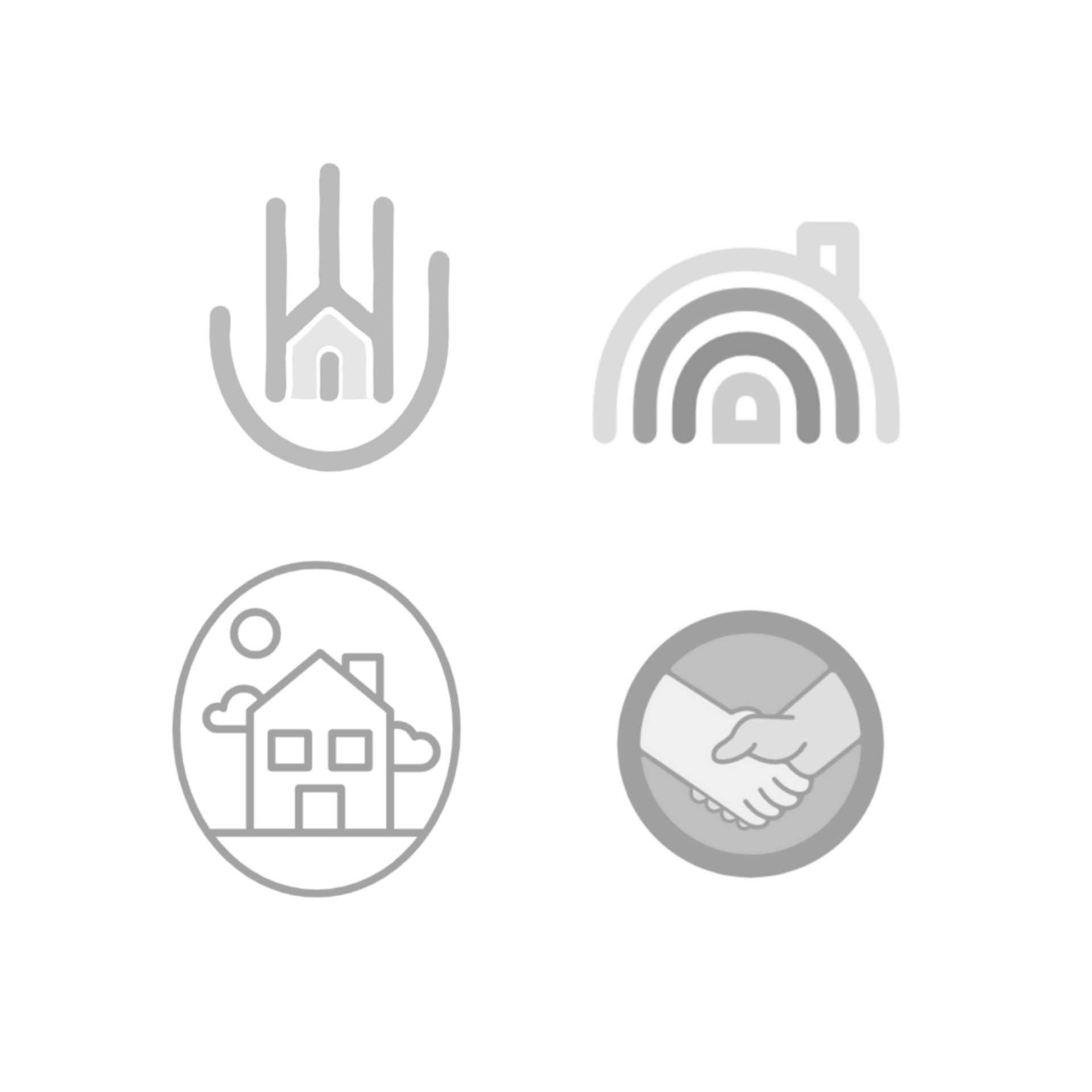
We knew the brand that represented Hand in Hand would need to convey warmth and compassion, while also representing a strong sense of community and the idea of working together to achieve a common goal. We initially explored variations of the icon using a hand and a house, but some of the harsher qualities of these concepts (i.e. straight lines) left them feeling stark. It wasn’t long before our team discerned the imagery needed was a heart. Adding curves to the icon helped soften the logo to create the warmth that was needed.
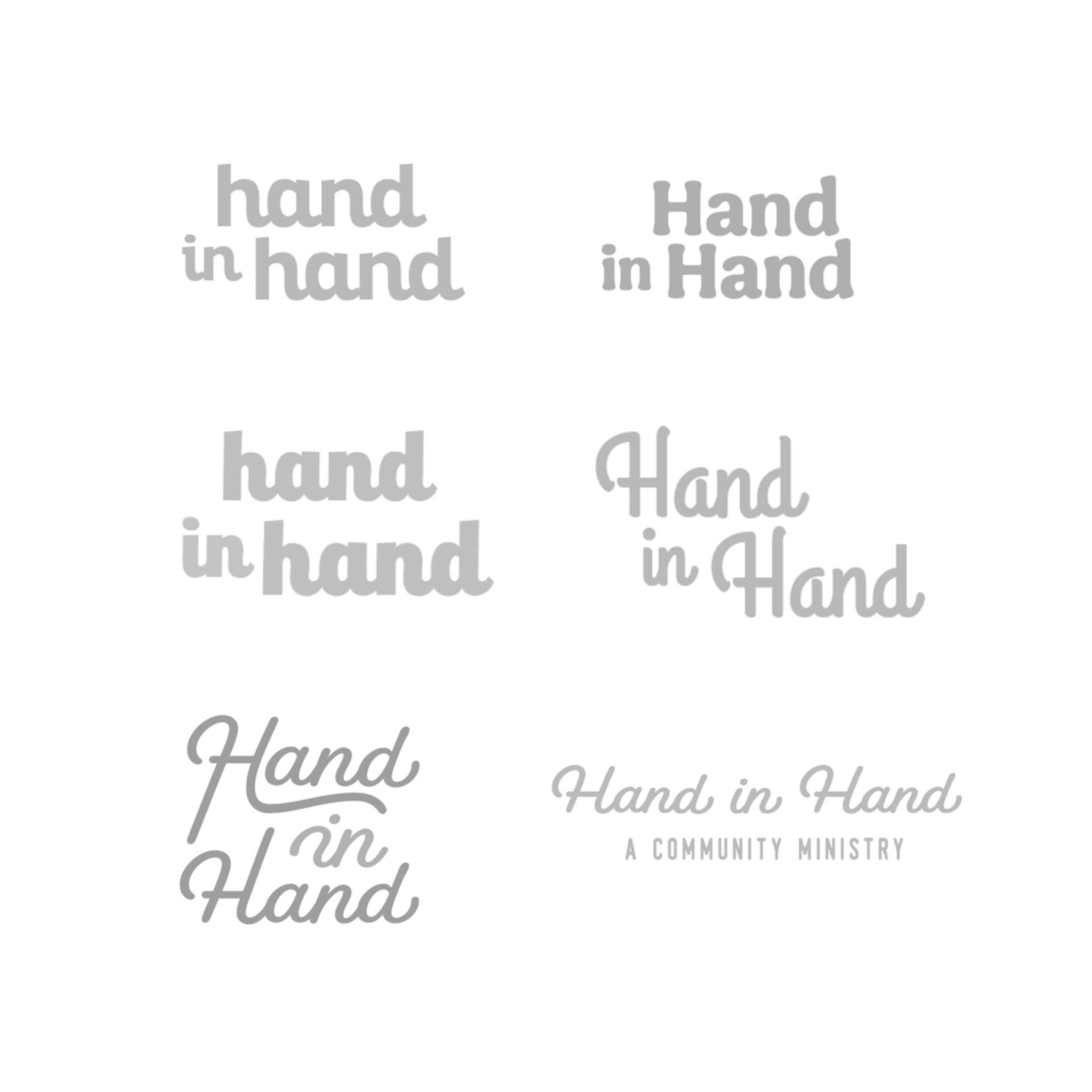
Given that Hand in Hand’s work primarily centers around children, the real challenge when it came to their logo was striking the right balance between playful and professional. Utilizing a scripted font made this even trickier. Additionally, we wanted to express Hand in Hand’s grassroots, personal approach while also communicating it is a reputable organization for both donors and potential clients alike. To achieve this balance, we opted to pair the more playful icon and font with a more professional secondary font—a thin sans serif.
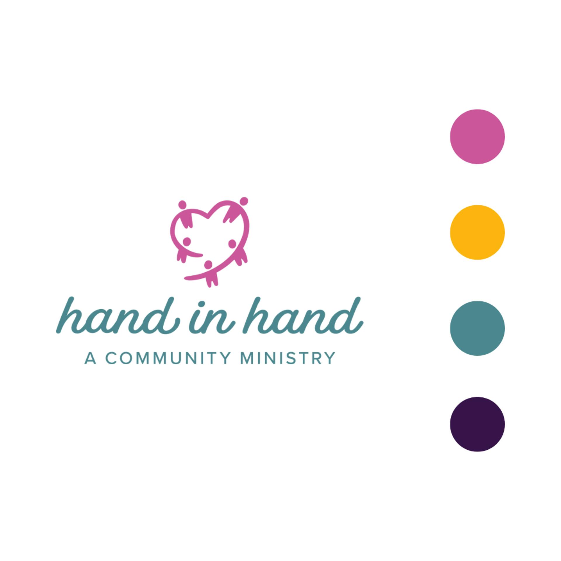
Once the logo (icon + font) design was finalized, we moved on to color exploration. Hand in Hand’s board and volunteer team is primarily composed of women, so while we knew the logo would err on the feminine side, we wanted to discover ways to neutralize the rest of the brand. Given the colors the client selected for the logo, for the rest of the scheme we opted to capitalize more on the shade of green and less on the pink that was used. We also introduced a bold yellow to their website in order to help tone down any overtly feminine undertones.
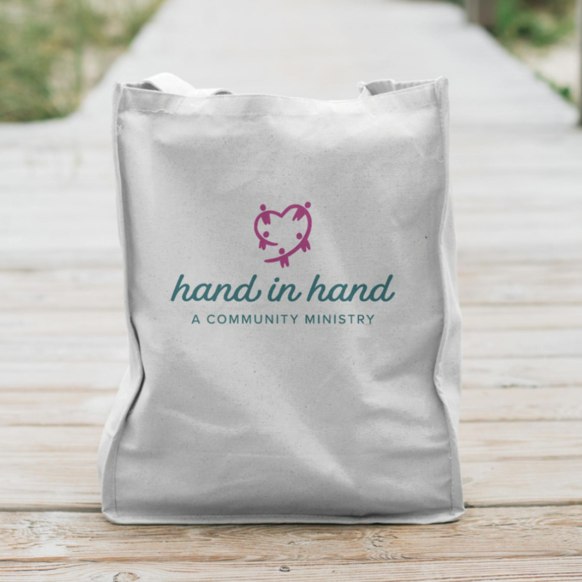
The end result was a soft but strong, warm but neutral, and playful but professional new logo for Hand in Hand. One they can proudly display on everything from their new website, to yard signs, to branded sweatshirts and the packaging for items delivered to clients.
Here at ALINE, we believe branding is a journey, not a destination. That's why we're in it for the long haul with our clients. We don't stop at designing logos. We partner with you to build an identity and tell your story in a way that values your values and communicates your culture. Then, we give you the tools to inspire your audience on an ongoing basis. Ready to get started? Our team is ready to help guide you through the process from start to finish!

© 2026 ALINE, A Marketing Company. All Rights Reserved. | Privacy & Legal | Accessibility Statement